I know it sounds simple, but it took me a while to figure out. Perhaps this will help you avoid a headache.

tl;dr
I’m using Unity 2013.1.0 with Unity UI 1.0.0. Your hierarchy should contain the following objects and components:
- Canvas – I’m using the UI Scale Mode of “Scale With Screen Size” and default Reference Resolution width of 800
- A – Parent – an empty object. Comes with a Rect Transform, which is the only one you need to modify to suit you.
- B – Outer Horizontal Layout with the following components:
- Horizontal Layout Group, enable Control Child Size and Child Force Expand
- Content Size Fitter, set to Preferred Size
- Layout Element, enable only Preferred Width and set to your canvas reference resolution width (800 in my case)
- This object has the following children:
- C1 – Left Margin, with the following components:
- Layout Element, with a Min Width (this is your distance from the edge of your screen), and Flexible Width that’s half of the Preferred Width of B.
- Image (optional) to help you visualise the edges of the layout element.
- C2 – Inner Horizontal Layout, with the following components:
- Horizontal Layout Group, with Control Child Size enabled.
- Image – the background of your text box.
- Children:
- Your text. I use a TextMeshPro component. Ensure Wrapping is set to Enabled.
- C3 – Right Margin. A copy of C1. They must appear in the hierarchy in this particular order.
- C1 – Left Margin, with the following components:
- B – Outer Horizontal Layout with the following components:
- A – Parent – an empty object. Comes with a Rect Transform, which is the only one you need to modify to suit you.
At minimum, component-wise, you’re going to have 2 Horizontal Layout Groups, 1 Content Size Fitter, 3 Layout Elements, Text, and an Image.
Why?
I was working on a text box for a visual novel, and needed it to behave a particular way. It seemed like an easy thing at first – a layout container already expands to fit its contents, all I needed was a way to limit its maximum width, at which the text box would stop growing in size and the text would start wrapping.
To my dismay, there is no Max Width property on Unity UI’s Layout Elements, so longer lines of text would expand the text box infinitely and never wrap. And the Preferred Width – rumoured to act as a “sort of” Max Width, made the width of my text box almost entirely static, not shrinking when expected. Naturally, I went to Stack Overflow and the Unity Forums for help, but nothing seemed to quite work the way I wanted.
How?
The trick is having a left and right margin to fight for space against your centered text box. The epiphany came to me after noticing the particular wording in Unity’s documentation of the Layout Element:
Flexible Height The relative amount of additional available height this layout element should fill out relative to its siblings.
Note the phrase relative to its siblings. In my head, I just wanted to have a single container on screen and control the behaviour of its width. But it’s actually easier to imagine it as three containers, all competing for space within a larger container. If you’ve ever worked with an application that has you dragging and dropping multiple elements into a horizontal / vertical layout, you might be familiar with the workaround of adding empty boxes on either side to act as a better-behaved form of padding. This is what we’re doing here.
Even then, it’s not immediately obvious which components to use. After some trial and error, I arrived at something that worked nicely.
Follow the tl;dr for exact instructions, but the key points are:
- We’re working with four levels of hierarchy here. The middle two are horizontal layout containers (let’s call them outer and inner). The outer must force its children to expand, no matter what. It is also a layout element by itself, and the only one to have a Preferred Width, which behaves like a max width for the entire container.
Changing the Preferred Width has the following effect:

- We should only have one Content Size Fitter in the layout, and Preferred Size is the only option useful to us.
- Three elements have explicitly defined width properties, via the Layout Element component. We already know about the outer layout container, which helps us constrain our maximum width. The other two are the margins – set their Minimum Width and Flexible Width here. In this particular context, it’s the Flexible Width that sort of works like a maximum width – the margins will expand if there’s space, but no further than the flexible width. I’m setting it to half the canvas width for each – but if you want the text box in the middle to still show a bit, even if there is no text to show, make the Flexible Width value lower.
- Keep the values the same for both margins to keep things centered (or don’t). Don’t define any width with the middle object, it’s going to be entire driven by the text contents (until it hits the Minimum Width we defined on the margins).
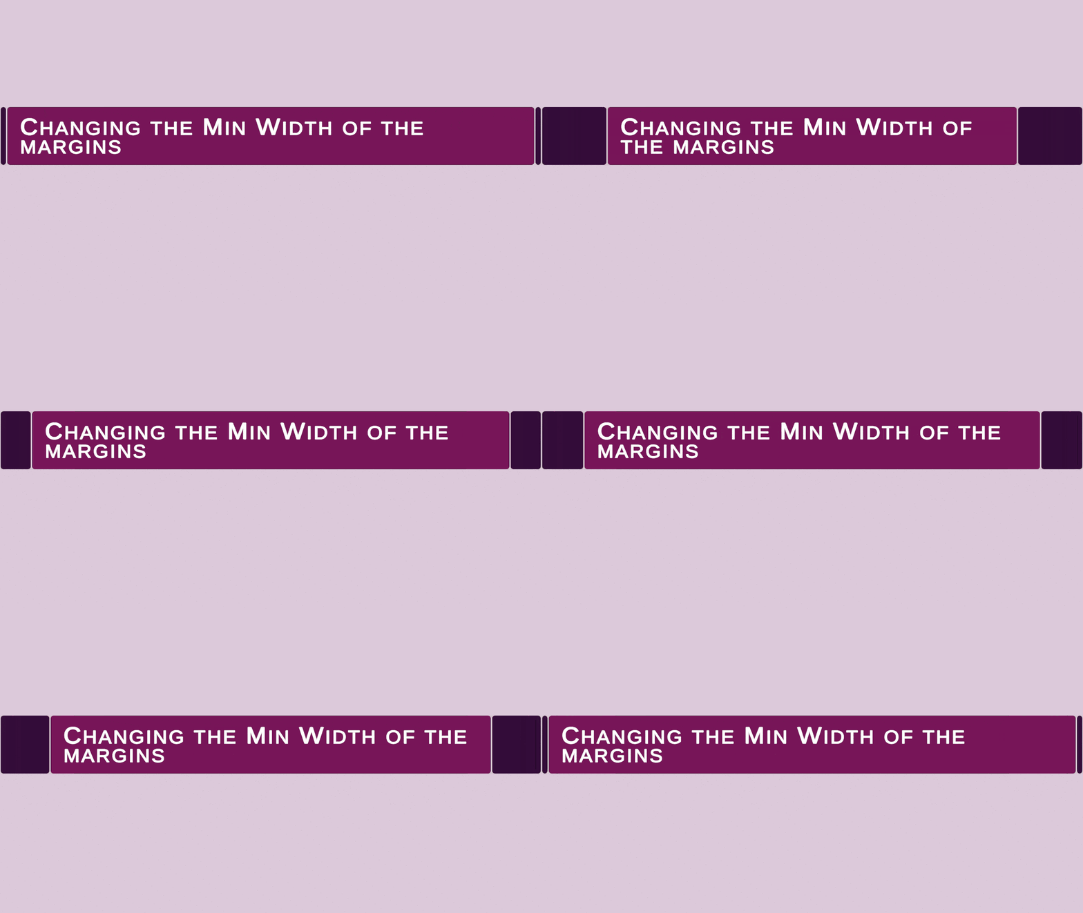
- Here’s the effect of changing the Min Width on both margins:

- And here’s how decreasing Flexible Width of the margins grants the center box more room, even if there’s no text to occupy it.

- Finally – I’m not entirely sure why I couldn’t do it without the top-level Parent object (it breaks), but it is useful to have as the root of your layout regardless. Let me know if you know the answer to that.
If there’s any interest in it, let me know and I’ll share a prefab.
